The Polished Listing — Branding + Website
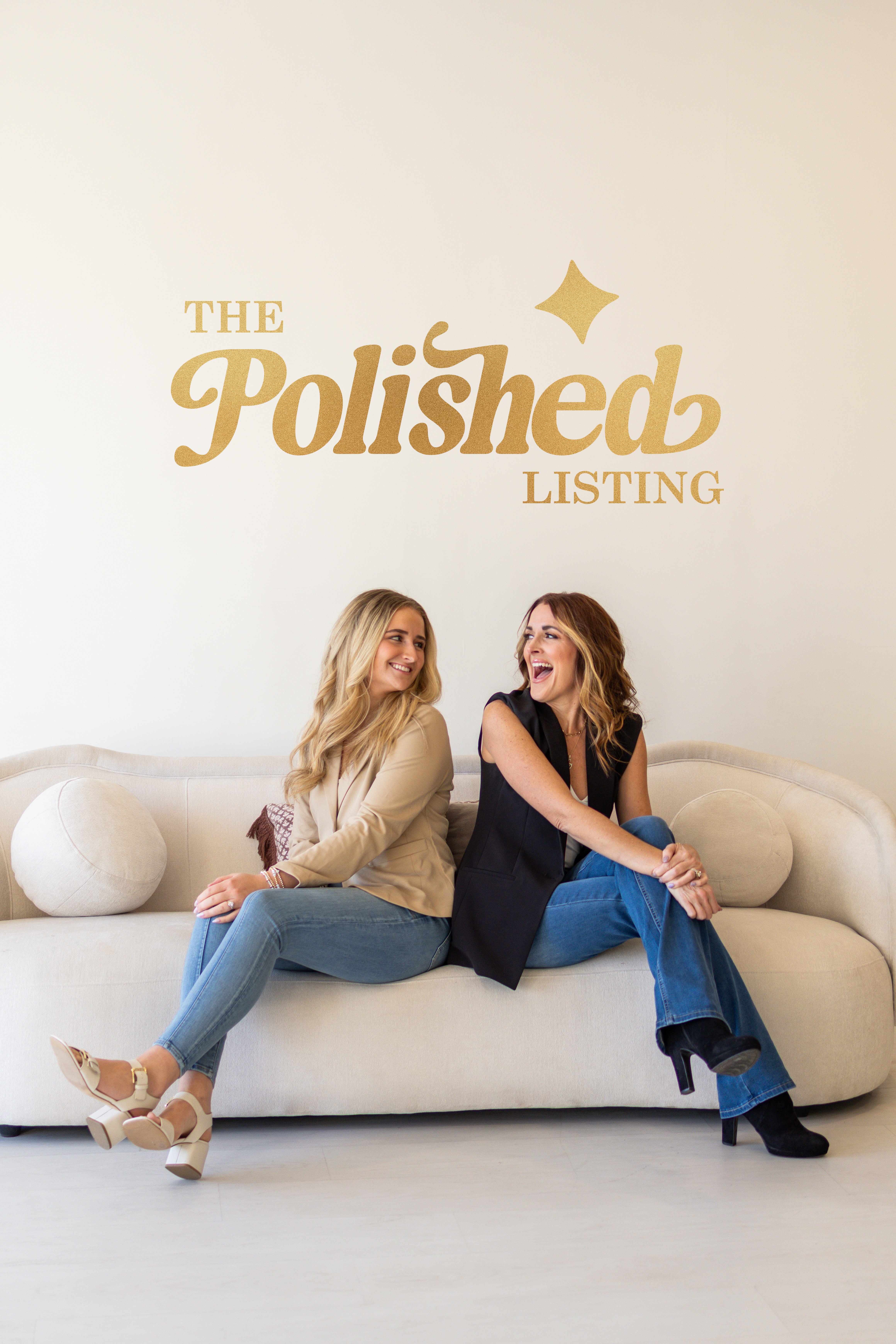
The Polished Listing is a real estate staging and photography company based in Nashville, Tennessee. Founded by Stephanie Wilburn and Tatum Swoape, they offer a full suite of services designed to help homes sell faster and for more — including occupied and vacant staging, real estate photography, drone photography and video, and curated staging-and-photo bundles.
When Stephanie and Tatum reached out about branding and a website, I was immediately drawn to the project. This was a new industry for me — I'd never worked in the real estate or photography space before — and I saw it as an opportunity to create something that actually stood out.
The Problem with Real Estate Branding
If you browse logos in the real estate and home staging industry, you'll see the same things over and over — a roofline, a house silhouette, a camera lens. They all blend together. Stephanie and Tatum originally had something similar in mind — a house combined with a camera lens — but they also told me they wanted the brand to feel polished, professional, and unlike anything else in their market.
That tension between what the industry expects and what actually makes a brand memorable is exactly where I love to work.
Landing the Logo on the First Concept
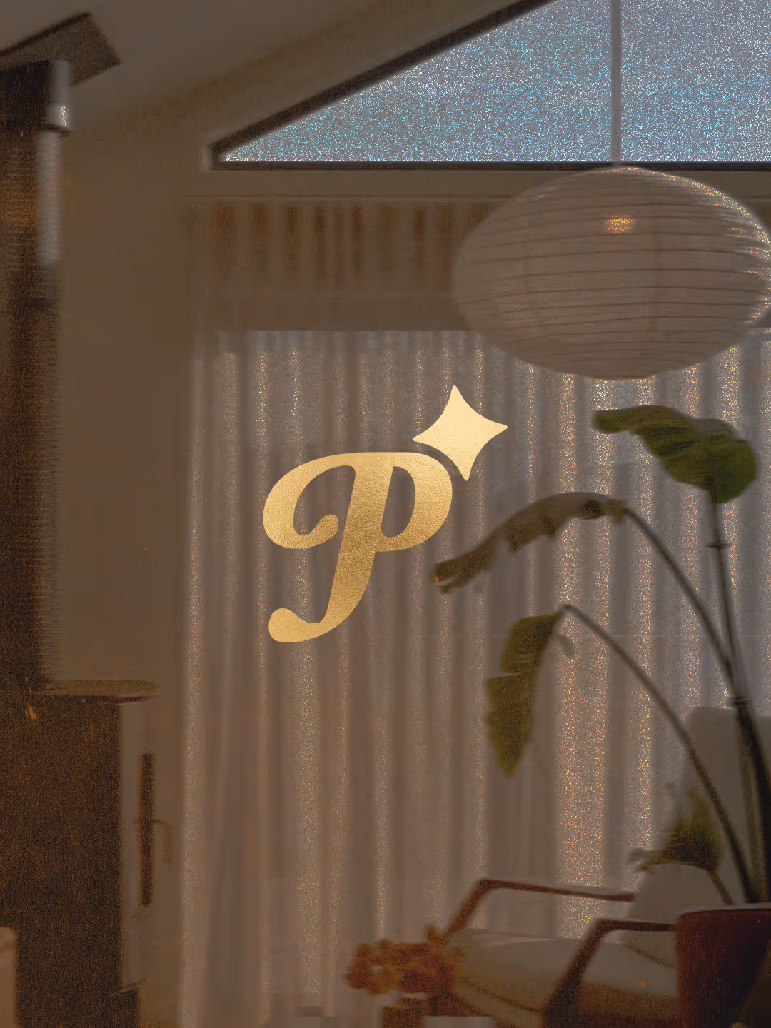
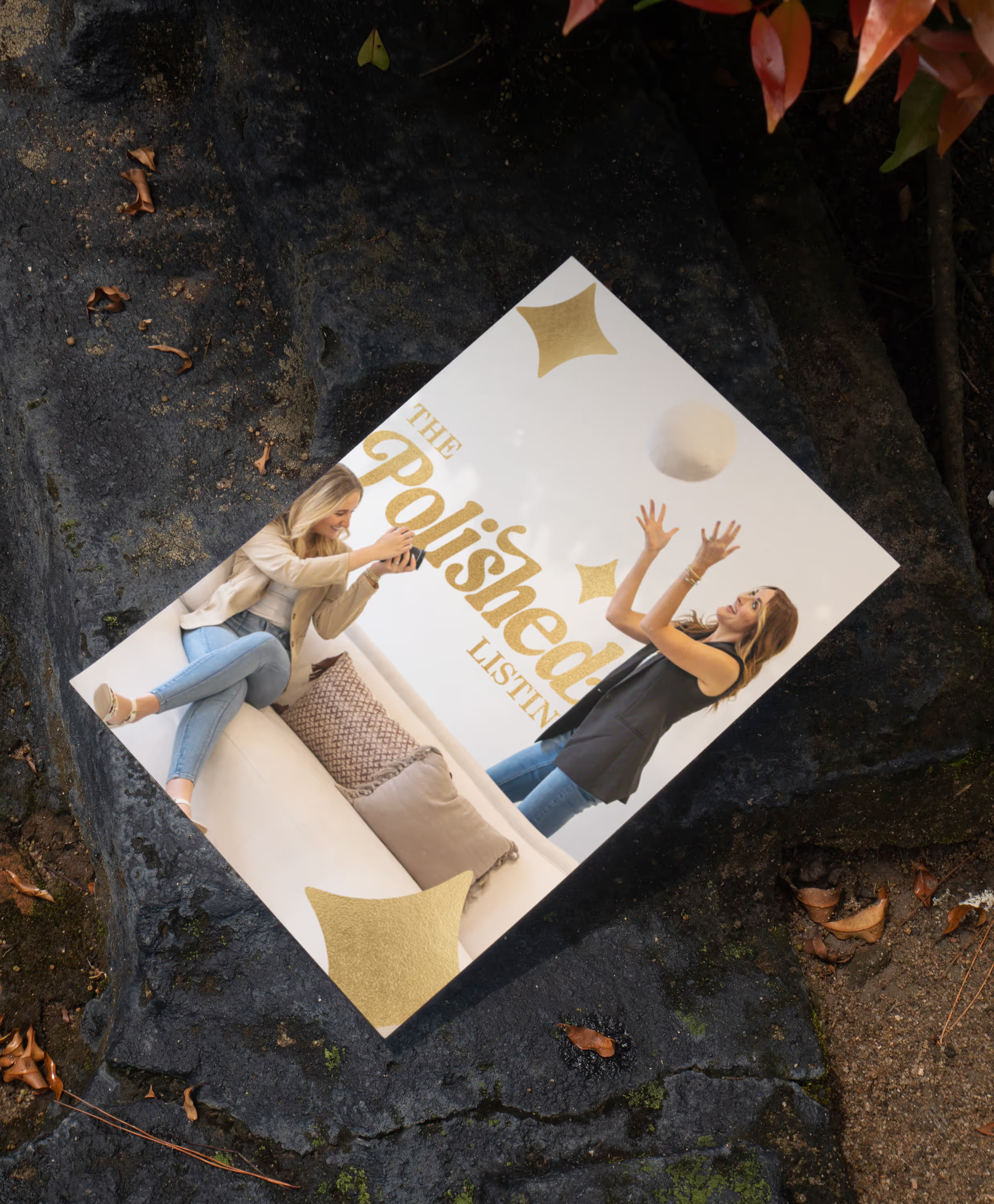
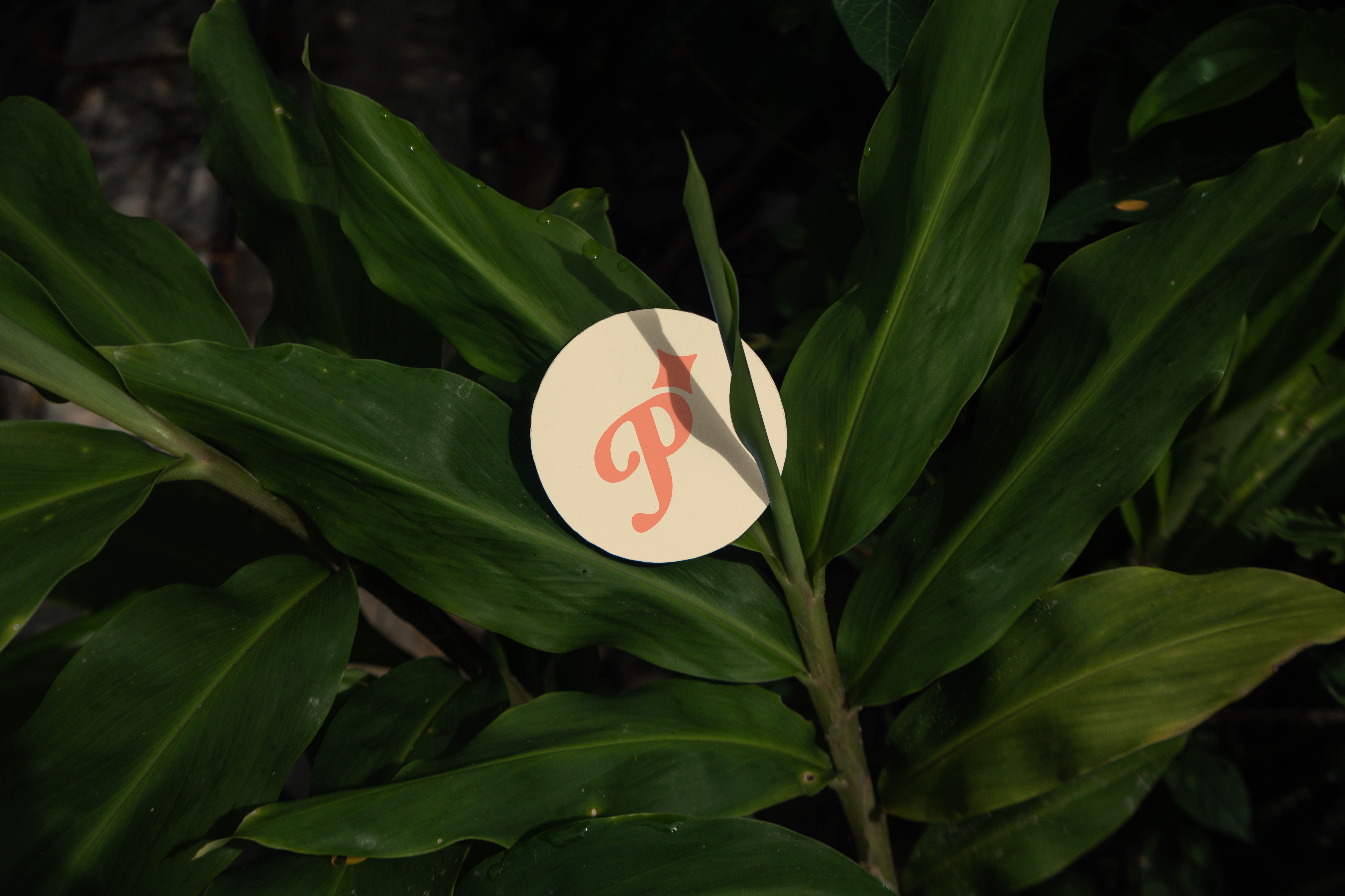
I took their desire for something "polished" and ran with it literally. Instead of leaning on predictable real estate imagery, I designed a custom script "P" lettermark paired with a four-point star — a sparkle that represents that final polished touch their staging and photography brings to every listing.
The mark is elegant without being fussy. It works in gold foil on a business card just as well as it does reversed out on a dark background. And it communicates exactly what The Polished Listing does — they make homes shine.
When I presented the concept, Stephanie and Tatum loved it immediately. No revisions, no second round — they accepted the very first design. That doesn't happen often, and when it does, it tells me we nailed the vision.
Building the Brand System
With the logo locked in, I built out a full brand identity around it. The color palette leans into warmth and sophistication with tones I named specifically for their industry:
- Curb Appeal — a golden coral that brings energy and warmth, inspired by the golden-hour light that makes homes look their best in listing photos
- Fresh Linen — a soft, warm cream that feels like a perfectly staged living room — clean, inviting, and elevated
The typography pairs a refined script with clean, modern type — striking the balance between boutique luxury and professional approachability that Stephanie and Tatum wanted.
The Website (Coming Soon)
The website for The Polished Listing is currently in development. It's being built in Webflow and will showcase their staging and photography portfolio, outline their full service offerings, and make it easy for realtors and homeowners in the Nashville area to book a consultation. This section will be updated once the site is live.
What Made This Project Special
Every industry has its visual clichés. Real estate has rooflines and camera lenses. Churches have crosses and steeples. The best branding work happens when you push past the obvious and find a concept that's both unexpected and immediately right.
The Polished Listing is a great example of that. By letting go of the expected, we created a brand that's distinctive, memorable, and built to grow with their business.